Transit Art Program Webpage Redesign
UX Design Project
Timeline
June 2025 - Present
Summary
Sound Transit's art page engages 41M+ annual passenger experiences with artworks along the entire Puget Sound transit system. However, it has been experiencing decreased engagement in navigation time, active users, and views.
I lead the redesign of the site across web and mobile platforms. Identified critical issues through user testings and redesigned high-severity flows and tasks.
My Roles
UX Design Lead: I reconstructed the information architecture, introduced new subpages, and led feedback sessions with the editorial team to implement MVP solutions that fulfill user needs and business visions.
User Researcher: I lead heuristic evaluations and usability tests to identify key issues of the current website, converting insights into actionable design directions.
Outcomes
44% Increase
In average task completion rate (47% to 91%).
140%
In average system usability score (33 to 89).
Secured launch
in Q1 2026
Don't forget to check out my Bonus Project;)
I initiated a self-lead project leveraging vibe coding, micro-interaction, and animation skills to re-imagine how passenger can engage with the process of fare payment!
Overview
Less paths in confusion, more room for discovery
Making 100+ artworks exciting to browse through
The STart Page is a unique highlight of the Puget Sound transit system. Enhancing the digital presence of the artworks meant impact on daily transit experiences for millions!
MENU
EN
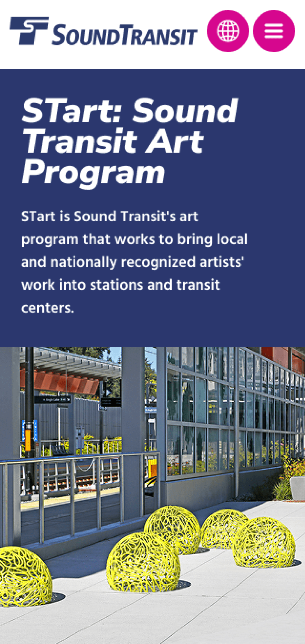
STart: Sound Transit Art Program
STart is Sound Transit's art program that works to bring local and nationally recognized artists' work into stations and transit centers.
Home / System expansion / Creating vibrant stations / STart: Sound Transit Art Program
About STart
STart, Sound Transit's art program, features works by nationally known and emerging public artists, many of whom live in the Pacific Northwest. Their work helps welcome and engage riders at stations and transit centers.
Subscribe to news
Artwork Gallery
Explore how local artists shape Sound Transit spaces — artworks that reflect community identity and enhance everyday travel.
View gallery
Public art map
Use the interactive map to find artworks at Sound Transit stations and facilities — discover artists, learn about each installation.
View interactive art map
Open calls for artist
Next deadline: June 30, 2025
Get you artwork featured in the STart program!
View opportunities
Subscribe to email elerts
Discover artworks along our system
STart utilizes 1 percent of construction budgets, as identified in each voter-approved capital initiative, to bring a human scale and thoughtful detail into the large transportation infrastructure that Sound Transit builds.
Learn more below by exploring the Platform blog and our featured work

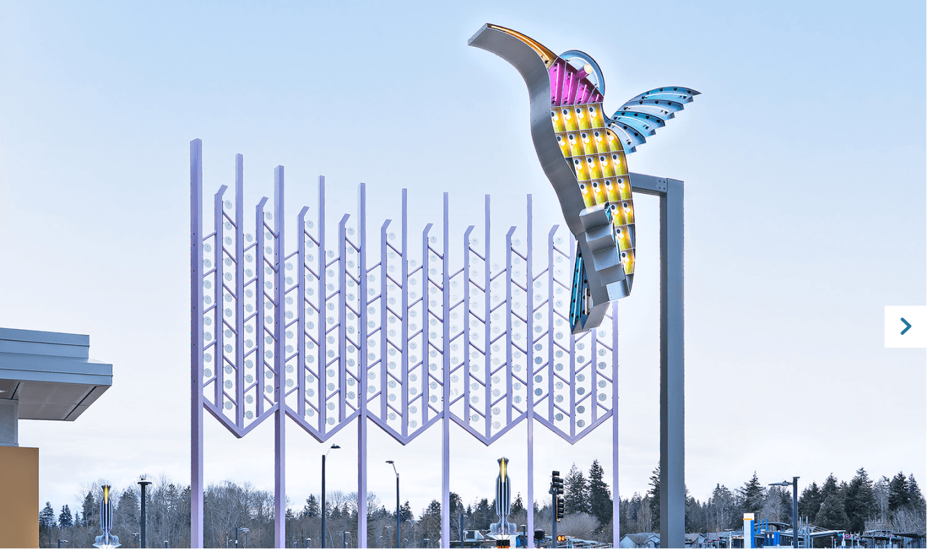
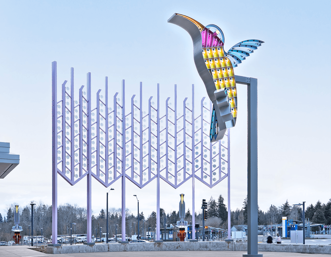
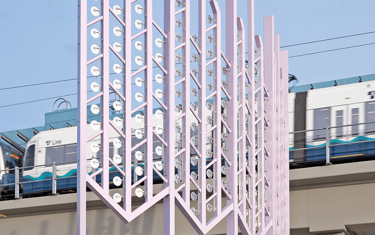
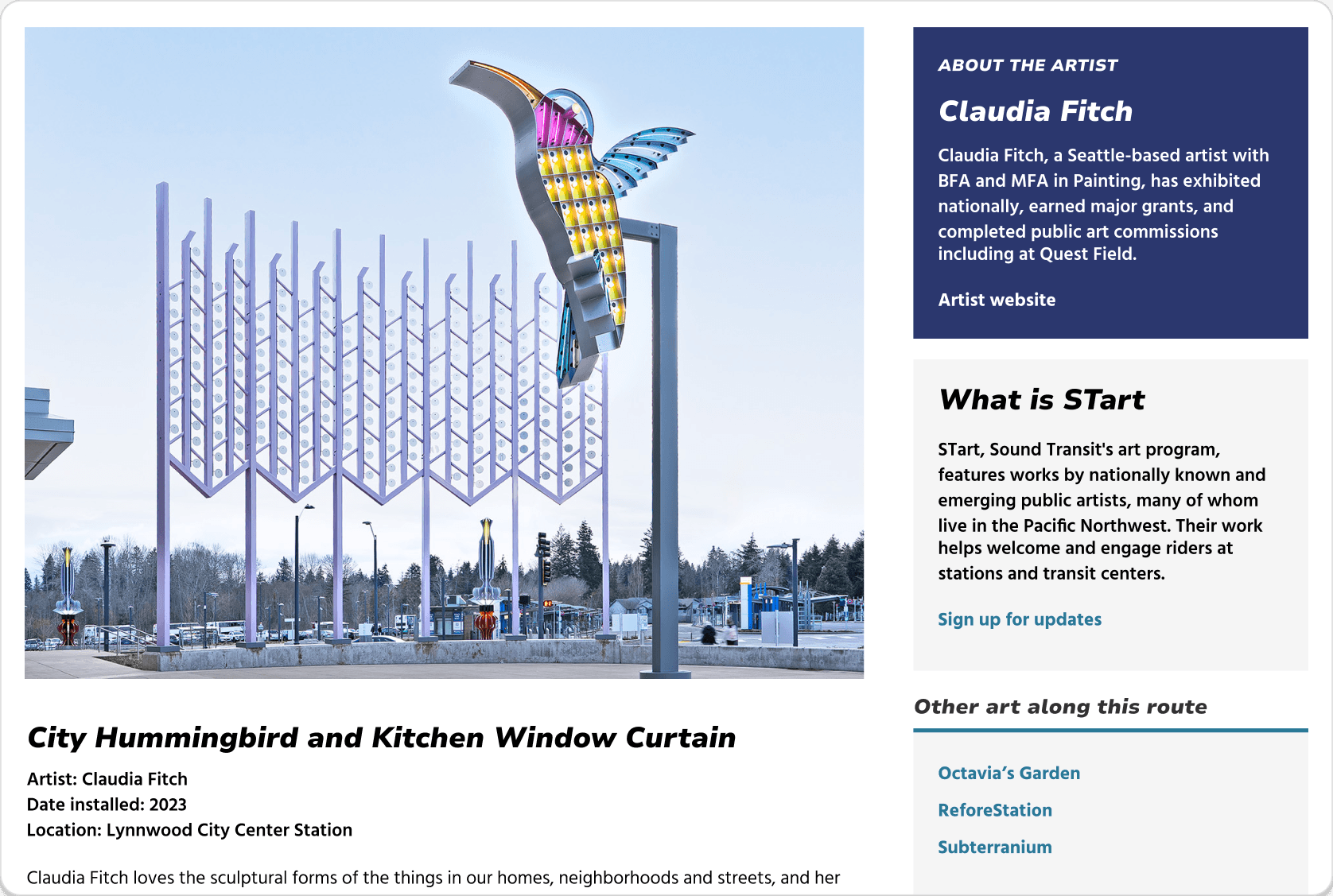
City Hummingbird and Kitchen Window Curtain - Lynnwood City Center Station
City Hummingbird honors the rich history of neon road signs that once lined Highway 99. Its companion, Kitchen Window Curtain, acts as its backdrop, turning the whole plaza into an enormous...
©Claudia Fitch, 2023, Lynnwood City Center Station
View more


Frequently asked questions

Resources
Contact
Questions about Sound Transit’s art program?
Feel free to reach out to us at
general resources
STart Sound Transit Art Program
Guide to artwork on Link light rail
Guide to artwork on Sounder commuter rail
artist resources
Tips for artists on acquiring insurance
Artist contract
Certificate of liability insurance
Insurance requirements for artist contracts
Clearing up the way for navigation
By completely reconstructing the website's IA structure, I utilized existing design system components, as well as adding in some innovative mind to create new presentations for unique information that are accessible and support intuitive navigation.


New features for digital exploration
New content and new presentation turned into 2 new features: Artwork gallery and Interactive artmap that secured launch in the art website's roadmap of 2026!


Discovery
Important, but hard to use
All-in-one package for artists and audiences
The Transit Art Website is the online source with all kinds of information an artist or audience may need. From engagement opportunities to artwork information.

The (poor) performance in numbers…
After the redesign kick off meeting with the digital team, I utilized Google Analytics to identify key metrics that showcased the current site's performance.

Two distinct audience, both confused and lost
Throughout the discovery phase, I realized that the two main target audiences were never defined during the original design, which lead to the main problem of poor info discoverability.

Prioritizing our redesign goals
I came to realize that this redesign was not just about a simple visual refresh. The users weren't reaching the essential information they needed, which results from scattered structure and hierarchy. I decided to dig deeper into this aspect.
Research
User testings in the lab & in the fields
I conducted field studies and semi-structured interviews along 10 stations and 6 potential users, experiencing first hand on users pain points with low engagement and low discoverability of the art program information.
unaware on existence
19/20
average task succession rate
47%
average SUS score
32.5
10 field studies
6 usability studies
Key Insights
High priority insights from user behaviors
Identifying the overlapping pain points amongst our target audiences highlighted that unclear navigation and outdated information hierarchy was causing major difficulties for our users.
Insight 1
Low discoverability on important links and resources
Critical information for distinct audiences are easily overlooked. such as program introduction and artist contracts are scattered in the side bar.

“Which of these are important to me 🤔?”
Insight 2
Overly dense contents causing unclear navigation for distinct target audiences
All 6 participants expressed being overwhelmed by the current website content layout and confused by repetitive CTAs and unrelated descriptions such as the file size, which discourage them to further explore.


MENU
EN
"The information looks overwhelmingly dense…"
Insight 3
Outdated and demotivating visual style
Participants reflected on how "un-exciting" the website experience was, requesting a more modernized visual style and layout.

“This feels internal...not user friendly at all...”

Address critical usability and accessibility issues,
while presenting a refreshed visual presentation of the STart page.
Design Goal
Design stratergy
MVP solutions within constraints
Before defining my redesign strategies, I collaborated with the content editorial team, the engineering team, and the visual lead to determine our MVP solutions working with constraints.
Digital Art Gallery
Physical Touchpoints
Structure & Visual Revamp
Design
Exbracing ambiguity in initial ideas
I drew inspiration from world-wide transit systems to understand best practices of transit art page layouts. Although not all explorations were kept, this gave me the opportunity to think outside the box.
LOGO
Artwork name
Artwork name
Artwork name
Artwork name
Artwork name
Artwork name
Artwork name
Artwork name
Artwork name
Artwork name
Artwork name
Artwork name
Artist name
Artist name
Artist name
Artist name
Artist name
Artist name
Artist name
Artist name
Artist name
Artist name
Artist name
Artist name
Date
Date
Date
Date
Date
Date
Date
Date
Date
Date
Date
Date
Search by artist, project, station name etc.
Line
Station
New art/ news/announcements
STart: Sound Transit Art Program
Gallery
About
STart is Sound Transit's art program that works to bring local and nationally recognized artists' work into stations and transit centers.
Join as artist
Resource
LOGO
Artwork name
Art in everyday life provides positive experiences for people riding Sound Transit trains and buses, and for people living near its many transit centers. Artists respond to the local character of neighborhoods in artwork specifically created for the stations and facilities the agency operates. STart utilizes 1 percent of construction budgets, as identified in each voter-approved capital initiative, to bring a human scale and thoughtful detail into the large transportation infrastructure that Sound Transit builds.
STart, Sound Transit's art program, features artworks by nationally known artists as well as emerging public artists. Many live in the Pacific Northwest. Their work represents a diverse range of style, scale and perspective that creates welcoming and engaging places.
Artist name
Location
Date
Artwork name
Station name
Artist name
More artwork
Artwork name
Artwork name
Station name
Station name
Artist name
Artist name
>
STart: Sound Transit Art Program
Gallery
About
STart is Sound Transit's art program that works to bring local and nationally recognized artists' work into stations and transit centers.
Join as artist
Resource
Initial versions of wireframe explorations
(that were not kept but influenced the final designs)
Iterations
Surfacing critical contents at first glance
I lead 5+ rounds of design critic sessions with the PM, UI design lead, and engineers to iterate on the designs. The final version gathered critical information that was scattered in the page during our first version, and presented in a clear at a glance view.
Design highlights
A clear title and simple description is what they need
I minimized the contents and reorganized the homepage information and design layout. This allowed different target users to quickly identify the information that they need.
So, what's new?
I gained stakeholder's buy-in for two new features that would boost functionality and engagement of our target users. Here are the new features:
New Gallery
A clear and comfortable gallery experience
I introduced a refreshed gallery view of all featured artworks, each with a dedicated information page including all the essential contents that a viewer would want to know. The artworks are categorized into filters that support efficient discoverability.
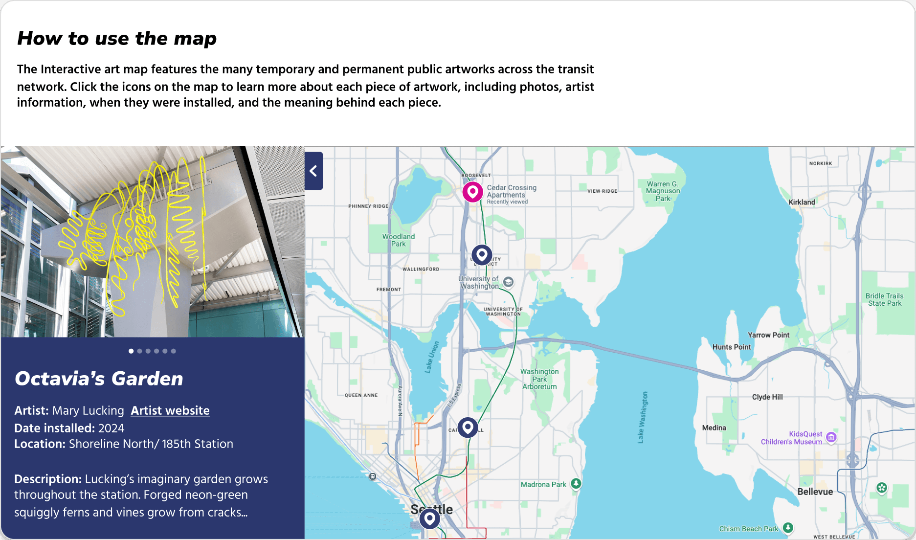
And…the Interactive art map!
The interactive map allows users to explore the artworks along the transit lines interactively. This component will also be implemented in further development of the website!
An accessible visual refresh
I created both web and mobile versions for the webpage. Working with the design style guide and revised 10+ components into accessible assets used across the whole agency's design.


I ensured that every feature is accessible for mobile version to fulfill the mobile-first approach of the design.

I created new web and mobile design components for the agency's figma design style guide.
Validation
The improvements were significant
Creating an artwork website is beyond visuals and aesthetics. I asked internal and external users to experience the new webpage, and these were the results.

Impact
Enhanced transit experience for millions
The new art page will be shipped in 2026!
Leading the redesign of the art page, which has faced low engagement for the past seven years, has been an incredible journey. I'm proud to introduce the new digital presence of our art program and create a more vibrant, engaging transit experience for our passengers!

Learnings
Be curious, collaborative, and creative!

Working with such a diverse group of interns was a blast!
Proactivity drives impact
Reaching out for 20+ coffee chats taught me that meaningful change starts with taking initiative to listen, connect, and build trust
Curiosity is the fastest way of learning
Asking questions and seeking mentors beyond the agency reminded me that curiosity not only accelerates learning but also opens doors I didn’t know existed
Intuitiveness is the ultimate shared language
I realized that when a design feels effortless to use, it bridges backgrounds, roles, and expertise better than any explanation I could give
Bonus self-lead project
How can we engage users in those mere seconds it takes to pay their fare?
In Seattle’s busy transit environment, it’s easy to overlook the simple act to "Tap the card"
Through my own experiences observing fellow passengers, I began imagining ways to enhance the interaction with our payment machines. I crafted the concept and mapped out the interaction flow in Figma. I collaborated with the ideation partner—Claude and Figma Make where vibe coding jumps in. Then I returned to my old friend—ProtoPie hand crafting micro-interactions and refining each motion until it matched my vision.


